Balance/Contrast
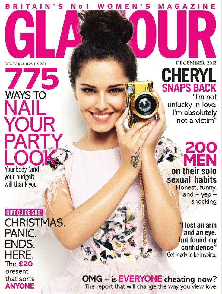
- Neutral white background with bright pink text helps to catch your eye.
- Easy to read text, with big bolded letters to highlight the important or interesting detail featured in the article.
- Model is placed right centered to grab your attention, she's dressed in white to blend into the background but her dark brown hair and complexion helps her stand out. Being accessorized with the yellow camera makes a cute statement with an addition of minimal color, along with the splash of floral on her shirt.
- Models photo is over magazine title to make her more noticeable as well, as she is the main focus.
Rhythm/Repetition (Movement/Pattern)
- All of the headlines and text use the same font.
- Using only pink text for words/phrases being meant to stand out, and black for the other context.
- Same amount of spacing between each little paragraph.
Emphasis/Alignment
- Large image of model placed in the center, having the text surrounding her.
- Subtitles are enlarged and bolded.
- Her dark brown hair contrasts with the white background and over the pink text, gaining your attention.
Unity/Proximity (Proportion)
- The cover was consistent with using minimal color but just enough to make headlines and the leading image stand out.
- Fonts and sizes relatively stayed similar throughout the entire page.
- Having brief quotes and explanations for the subtitles without diverting the headings.
No comments:
Post a Comment